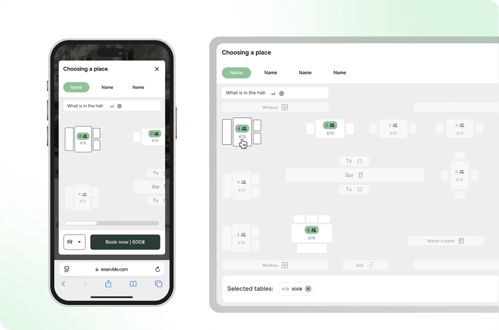
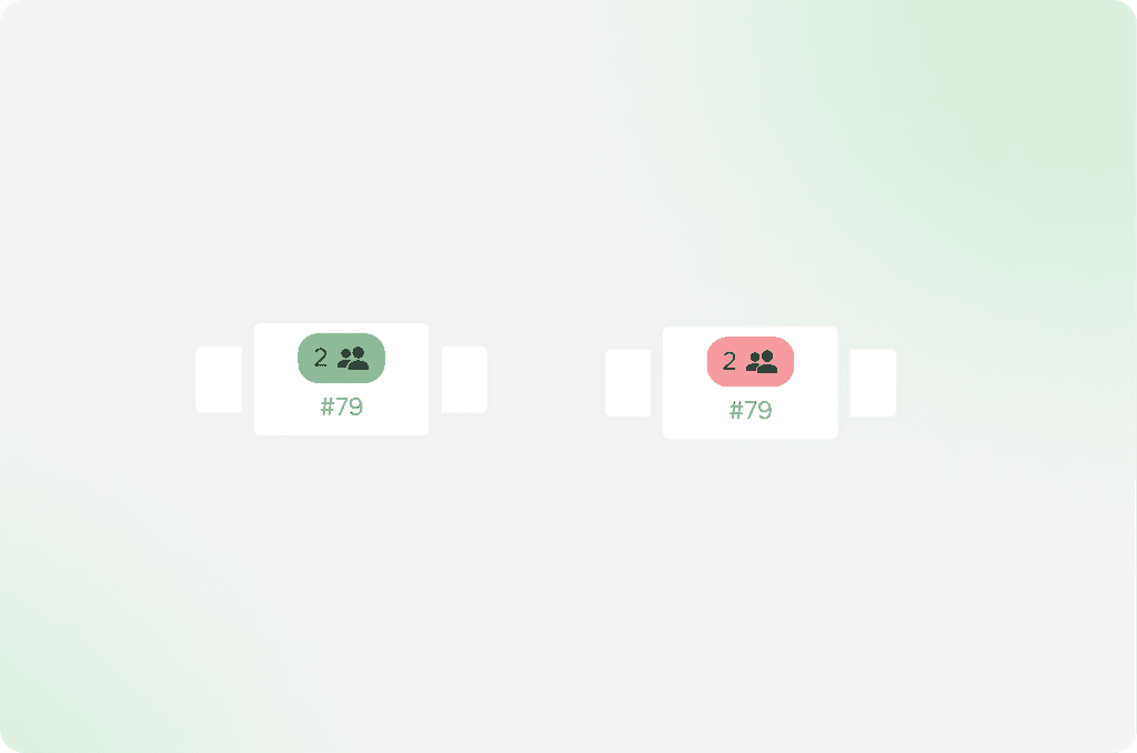
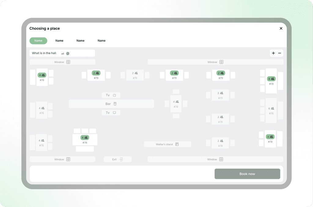
Role:

Senior Product designer

Working with:

Founder, Design team

Year:

2024

Goal:

The goal was to develop a detailed and user-friendly design for the table selection scenario, taking into account all existing technical constraints. Upon completing the design phase, comprehensive testing of the created scenario was planned. The testing was intended to ensure that the scenario fully met technical requirements and provided a comfortable user experience.

Problems and challenges:

Problem:

It was necessary to provide a clear visual representation of the table statuses so that users could easily distinguish which ones were already reserved and which remained available.

Solution:

Version 1:

For user convenience, a visual table status display system was developed using two types of designations. Tables that are already reserved are highlighted in red, immediately drawing attention and indicating that they are unavailable for selection. Free tables, on the other hand, are highlighted in green, signaling that they are available for reservation.

This color-coding was chosen for its intuitive clarity and universality, as red is traditionally associated with prohibition or unavailability, while green conveys permission or availability.

Version 2:

After testing, it became clear that 76% of users could not understand which table was occupied and which was free. Therefore, I decided to increase the contrast. As a result, 100% of users were able to clearly identify the status of each table.

Problem:

It was necessary to design an interface that would be convenient and functional for both PC users and those interacting with the system via mobile devices. This required taking into account the characteristics of different platforms, such as screen size, input methods (mouse and touchscreen), as well as page loading speed.

Solution:

To solve the problem, a responsive interface was created that automatically adjusts to different screen sizes and input methods — using a mouse on a PC and a touchscreen on mobile devices. The interface was simplified on mobile versions to improve loading speed and enhance ease of use.

Сhallenge:

The problem was that some users choose tables based on personal preferences and specific requirements. For example, some users prefer tables from which the television is easily visible, allowing them to watch shows or important events during their stay. Others, on the contrary, try to avoid seats near windows or doors, as these locations can be uncomfortable due to drafts, excess noise, or too much sunlight.

Solution:

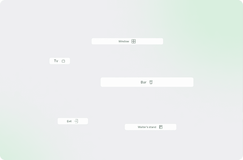
Therefore, a series of interface components was developed to ensure convenience and intuitiveness in navigation when selecting seats. These components include visual indicators that show users the location of important objects such as the bar counter, television, windows, doors, and other key areas.
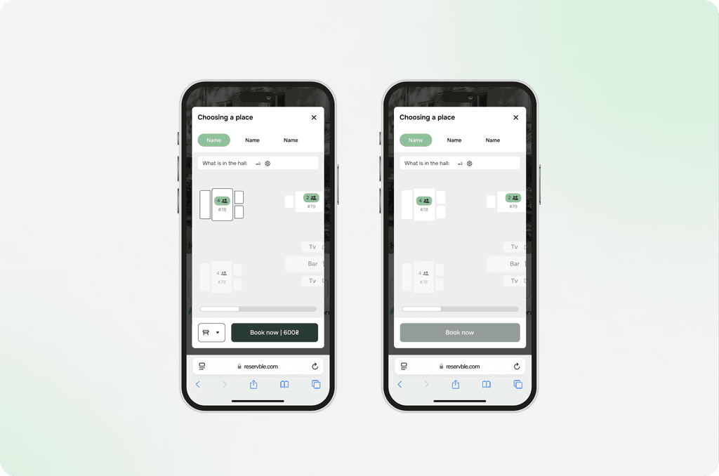
Сhallenge:

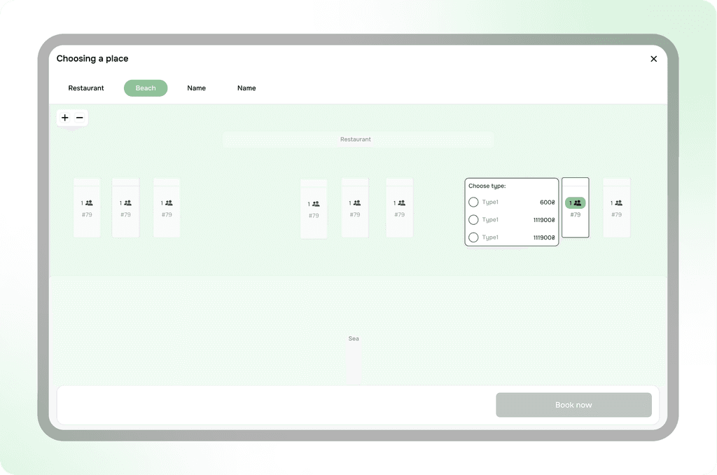
One of the key challenges was creating a universal solution that would allow the developed seating scheme to be used not only for table selection but also for other types of seating, such as lounge chairs or gazebos. This required taking into account various features of each of these objects, such as their location, functionality, number of seats, availability for booking, and other factors.

System:

At the end of the entire development and testing process, all the new interface components were successfully integrated into the design system. This allowed for the creation of a unified, standardized foundation for further development and maintenance of the project.

What’s the challenge?

What’s the challenge?

Glad to assist! Let’s draft it and figure out solution